Why Dashboard Dials and Gauges Are Useless for KPIs
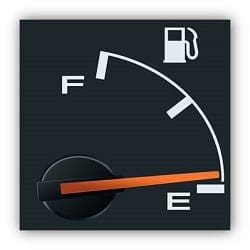
by Stacey Barr |Stephen Few’s arguments about dashboard gauges and dials can be summed up nicely in his own words: they “say little and do so poorly”. Agreed. But there’s one specific reason that gauges and dials totally suck when it comes to KPIs.

Performance measures, or KPIs as they are often nicknamed, are a very special type of quantitative information.
While you might have more than just performance measures on your dashboard, you need to display your performance measures in a very specific way or they will fall far short of their purpose.
The purpose of performance measures is to track change toward a target through time.
Just because you set a target doesn’t mean it’s sensible to compare every week or every month to that target. You have a target because you want performance to improve. Performance doesn’t improve immediately – you need to allow time to change your processes so they become capable of operating at that targeted level.
So performance measurement involves monitoring change over time, and looking for signals about whether it’s moving close enough and fast enough toward the target.
WARNING: Dials and gauges don’t show change over time!
Dials and gauges only show a snapshot of performance. They show this month compared to target, for example. They don’t show if performance is increasing toward target, or if it’s moving away from target, or if it’s refusing to change at all.
You need this context in your performance measures to help you prioritise how much attention you need to give to the initiatives that are supposed to be closing the gap between your starting level of performance and your targeted level of performance.
And because Dials and gauges don’t use this context, they are also incapable of showing you true signals in your measures.
WARNING: Dials and gauges highlight false signals!
The size of the gap between this month’s performance and the target is NOT a measure of how far away from target your performance is. This method of assessing performance completely ignores the fact of natural, routine variation.
Dials and gauges have you knee-jerk reacting to routine variation in your measures, and fail to tell you when there is a true signal of change toward or away from your target.
There is a smart way to show performance measures on dashboards.
The best way of presenting your performance measures in dashboards, which will both provide historical context and valid rules for signals of change, isn’t currently available. It’s what I call a smartline. But these are not available yet in any dashboard application I know of.
If only our dashboard vendors knew more about what dashboards are used for.
JOIN THE DISCUSSION:
Do you agree that discrete measures are as useful as continuous measures? What’s your reasoning? Share your suggestions on the blog.
Connect with Stacey
Haven’t found what you’re looking for? Want more information? Fill out the form below and I’ll get in touch with you as soon as possible.
167 Eagle Street,
Brisbane Qld 4000,
Australia
ACN: 129953635
Director: Stacey Barr


