Designing Questionnaires and Forms to Collect KPI Data
by Stacey Barr |The instrument you use to collect data for your performance measures or KPIs really needs to be capable of recording the data you really need. Forms and questionnaires are probably the most common instruments used in business to collect data, but few users realise that there is science and skill at the foundation of every useful form and questionnaire.

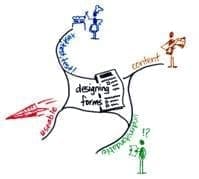
The framework for designing forms (of which questionnaires are one type) has 4 specific dimensions:
#1 Decide On The Content
When you know what data you want (or rather, need) then your first step in designing your form or questionnaire is to frame the questions and constructs that will get this data. Take care to focus only on what is useful, not everything that is interesting!
- Use your measure definitions to identify the data you need – don’t brainstorm the data you might like.
- For each piece of data you need, make sure you collect it in the format you need it – the units, the value range, the number format.
#2 Make It Understandable
Just because you know what your questions and constructs mean is no guarantee that the respondents or users of the form will too. So aspire to removing all sources of ambiguity and complexity from your questions and constructs.
- Use the simplest everyday language.
- Use the fewest words necessary.
- Include examples to illustrate valid answers to questions.
#3 Make It Useable
Irrespective of who will be filling out your form or questionnaire, they’ll probably be human and therefore prone to human error. So lay out the form in ways that minimise the opportunities for people to tick the wrong things, mark the wrong areas, miss important questions, or respond to parts not applicable to them.
- Design answer spaces to make answering easy – providing tick boxes or numbers to circle or lines to write on.
- Align the answer spaces with the questions, to make it obvious where to answer each question.
- Add some whitespace between each question, to make it easier for the eye to navigate the form.
#4 Test And Refine
Proof of the pudding is in the eating, so the only way you’ll know whether or not your form is half-baked is to put it to the test and see how it goes. Note how your pilot test respondents or users interpret the questions, whether they give the kinds of answers you expected and whether they are properly navigating through the form as you intended. Then go back and make your form work even better!
- Pilot test your form or questionnaire with 10 to 20 of your target users or respondents.
- Treat the pilot test like the real thing, so you don’t introduce any bias in how people fill out the form.
- Modify your forms question wording, answer spaces, and overall layout based on any problems observed in the pilot.
DISCUSSION:
Do you have any ‘war stories’ about data relevance or data quality problems that have resulted from form and questionnaire design in your experience?
Connect with Stacey
Haven’t found what you’re looking for? Want more information? Fill out the form below and I’ll get in touch with you as soon as possible.
167 Eagle Street,
Brisbane Qld 4000,
Australia
ACN: 129953635
Director: Stacey Barr


