Don’t Let Your Data Decide What You Measure
August 15, 2017 by Stacey Barr | Leave a Comment
Measuring performance takes some time and effort. But is that a good reason to rely only on readily-available data? (more…)

Measuring performance takes some time and effort. But is that a good reason to rely only on readily-available data? (more…)

Colour is a hugely important part of how we design our performance reports and dashboards, particularly the KPI graphs they contain. But there are 5 big mistakes that can destroy the ease and integrity of interpreting the information they contain. Are you making any of them? Let's find out...
Filed Under:
Performance Reporting and Dashboards


Filed Under: Performance Reporting and Dashboards


The world loves Stephen Few's bullet graph. It's small, concise and speaks volumes about the comparison between current performance and targeted performance. It's a prodigious improvement on dashboard gauges. In constructing a bullet graph, however, you have options. Here's the one I recommend...
Filed Under:
Performance Reporting and Dashboards

Lots of my new clients share the same habit (a bad one): they conclude whether performance is getting better or worse by comparing the current month's (or week's or quarter's) performance measure value with last month, or with a target or standard. If this month (or week or quarter) is worse, they go digging for the cause. Trouble is, they don't find that cause.

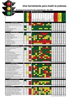
How to create a KPI traffic light dashboard or traffic light report to highlight signals in a clear, valid and constructive way, and avoid the 3 big problems. (more…)

Measure Up reader, Rick, opened up this debate again on my first post about whether gauges and dials can work for KPIs with this claim: "When it comes to KPI’s that are not time related gauges still can give fast insights to performance." And a few other readers agreed. But I still don't....

Haven’t found what you’re looking for? Want more information? Fill out the form below and I’ll get in touch with you as soon as possible.