How to Build an XmR Chart for Your KPI
by Stacey Barr |The most useful way to see true signals of change in your KPI is to use an XmR chart. Here are five easy steps to build an XmR chart for your KPI.

XmR charts are a statistical tool that evolved from the quality movement, many decades ago. They are from the family of statistical process control, or process behaviour, charts.
The fundamental purpose of this type of chart is to help us know if and when performance has changed, so we can avoid one of two judgment errors:
Error 1: We waste time trying to fix a problem that isn’t even there.
Error 2: We don’t even see a problem that is there.
And charts like the XmR chart achieve this purpose by displaying our measures over time, with enough historical context, and with clear rules for discerning true signals of change from the normal random variation.
There are three pre-requisites and five steps to build an XmR chart for your KPI or performance measure.
Understanding variation to interpret signals from our KPIs is the first pre-requisite to appreciating the power of XmR charts.
The second pre-requisite is to know what an XmR chart looks like. Get a quick feel for the anatomy of a basic XmR chart first:
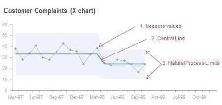
The third pre-requisite is to know the correct steps to create the XmR chart. And here’s how to build a basic XmR chart for your KPIs:
STEP 1: Gather between 5 and 30 historic values of your KPI.
XmR Charts can be created using as few as 5 consecutive measure values. If your measure has a lot of variability, you may need to use more than 5 points before your Central Line and Natural Process Limit calculations will be stable enough. There are no hard and fast rules here: you need to use your judgment and if necessary get some expert advice.
I’ve found it easiest to arrange the data in a spreadsheet, in columns for easier management of the data. This means two columns: one for the date value (like week or month) and one for the performance measure value at each date.
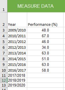
STEP 2: Arrange your KPI values into a line chart.
An XmR chart is a line chart, with two additional pieces of information added: the Central Line and the Natural Process Limits. But I always prefer to start with a basic line chart, so I can check for seasonal patterns, and normalise the values if any seasonal pattern exists.
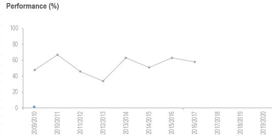
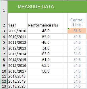
STEP 3: Calculate the Central Line, the baseline level of performance.
Add another column in your spreadsheet, and call it Central Line.
Your performance measure’s Central Line is simply the average of the first 5 or so values in the time series of your performance measure. Remember, if your measure has a lot of variability, you may need more than 5 values for the calculation. Use your judgment.
DON’T update the average as you add new performance measure values! You’re establishing a baseline with those first 5 or so values, a baseline that describes the performance level for the business process or result at that time. You’ll use this baseline for comparing new or subsequent performance measure values with. And only if you see a signal that the measure values are moving away from that Central Line will you recalculate it.
So once you’ve calculated it, copy that value all the way down the Central Line column, so all Measure Values have the same Central Line value.
STEP 4: Calculate the Natural Process Limits, range of normal variation.
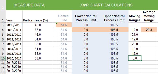
Add another four columns in your spreadsheet, and calling them Moving Ranges, Average Moving Range, Lower Natural Process Limit, and Upper Natural Process Limit.
Calculate the Moving Ranges.
A moving range is simply a series of calculations where you take the difference between successive values in your performance measure. When you get a negative value, just ignore the negative sign (the minus sign) – you just want to know the size of the difference between the successive values, not the direction of the difference.
You only need to start with the moving ranges for the first 5 or so measure values – the same ones you computed the Central Line from.
The purpose of the moving range calculations is to quantify the amount of routine variation in your performance measure.
Calculate the Average Moving Range.
Average the moving range values that you computed. If you based your Central Line on 5 measure values, you will have 4 moving range values, so average them.
The Average Moving Range will be used in the calculations to quantify how much routine variation your performance measure has. In other words, the Average Moving Range will help you put those upper and lower “Natural Process Limits” on your XmR Chart.
Calculate the Natural Process Limits.
The upper and lower Natural Process Limits on your XmR Chart will define the routine variation for the performance measure. They are set the same distance either side of your XmR Chart’s Central Line.
DON’T use standard deviation for XmR charts! Using the standard deviation statistic over-estimates the size of the Natural Process Limits. Here’s the correct way:
Lower Natural Process Limit = Central Line – (2.66 x Average Moving Range)
Upper Natural Process Limit = Central Line + (2.66 x Average Moving Range)
(NOTE: This value of 2.66 is always the value you will use. It is a statistically derived constant that makes the Natural Process Limits roughly equivalent to three standard deviations from the Central Line, since two-point moving ranges were used as the measure of variability.)
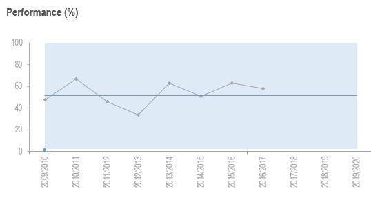
STEP 5: Add the Central Line and Natural Process Limits to your chart and look for signals.
There are three common signals you’ll look for in your XmR charts:
- Special cause (or outlier): A point outside the Natural Process Limits indicates something unusual happened. Just find out what it was, don’t try to fix it unless it’s a real problem, but it’s likely to be a one-off. Don’t recalculate anything.
- Short run: At least 3 out of 4 consecutive points closer to the same Natural Process Limit than to the Central Line. Find out the cause, whether it was something you did or something else that happened. Wait until you have at least 5 points then recalculate the Central Line and Natural Process Limits.
- Long run: At least 8 consecutive points running on one side of the Central Line indicates a sudden change. Find out the cause – it might be an initiative you implemented that worked, or something else. Use the points in the long run to recalculate the Central Line and Natural Process Limits.
None of these signals are present in the following example. It might be more helpful to measure this more frequently, like quarterly or monthly, to detect change more quickly:
There’s more to learn!
XmR charts aren’t difficult at all – but for many people not super comfortable with statistics or numbers, a little more help might be needed. And if you have a tricky KPI, you might need more help too.
Here are two references that are the best resources I can recommend for learning more about XmR charts:
- The best book to read on creating and using XmR charts is Understanding Variation, by Donald Wheeler.
- For more detailed how-to instructions for XmR charts, plus examples and spreadsheet templates, take my online course, Using Smart Charts.
The most useful way to see true signals in a KPI is to use an XmR chart. If you don’t know what it is, find out!
[tweet this]
DISCUSSION:
What are your experiences with XmR charts? Have they given you more insight that other ways of interpreting KPIs?
Connect with Stacey
Haven’t found what you’re looking for? Want more information? Fill out the form below and I’ll get in touch with you as soon as possible.
167 Eagle Street,
Brisbane Qld 4000,
Australia
ACN: 129953635
Director: Stacey Barr


