9.5 Tips for Great Data Visualizations
by Stacey Barr |by Michel Dekker, Nova Silva
Enrico Bertini explains in his recipe1 that studying plays an important role in becoming a Data Visualization expert. However, he also emphasizes it is just the beginning. This was probably the reason why Ben de Jong approached me a year ago to help him improve data visualizations at the bank he works for.

Ben was already familiar with the works of people like Stephen Few, Alberto Cairo and Andy Kirk. He clearly wasn’t looking for additional theoretical background. He was looking for someone with hands-on experience that could help him and the bank to the next level. And so we started to work together to improve the data visualizations of “his” bank.
Part of the assignment was to share our knowledge and experience with as many people as possible within the bank. We realized it would be difficult to get a broad audience interested if it would require a lot of their time. Furthermore, we wanted the session to be practical and not just an introduction. After attending our session, everyone should be able to directly apply the basics to their own work.
This is how we came up with our one-hour session called: 9.5 tips for great data visualizations. We conducted dozens of these sessions to confront people with the most common mistakes, illustrated by their own visualizations.
A couple of weeks ago Stacey was in The Netherlands, and I mentioned our “9.5 tips” sessions to her. Before I knew it she convinced me to write this blog post to share it with an even broader audience.
Tip 1. Start with WHY
In general, a visualization is the answer to a question. But how do you formulate an answer if you don’t know the question?
Therefore, you always start designing by an answering this fundamental WHY question. Although the question is easy, the answer (almost) never is.
This also implies you know your audience and take them into account.
Tip 2. Don’t make me think
Most visualizations require a lot of thought. Not because the audience is reflecting on the actions they need to take, but because they find it hard to understand the visualization itself. To avoid this, we need to apply three basic rules:
- Use encodings that people decode better2 (= faster and more accurate)
- Tell the truth as stated in the data, and nothing but the truth (don’t lie, and don’t lie by omission)3
- Avoid indirect measures: Do the math for your readers4
Tip 3. Cutting corners
When we use bar charts we “ask” our audience to compare area sizes. This can only be done right if these bars start at 0. Unfortunately, it is very common to have them start at other values, because otherwise “the differences are not clear enough”. If this is the case, choose an other chart type, because a bar chart scale should ALWAYS start at 0.

Figure 1 by “cutting” the scale the difference here looks way bigger

Figure 2 the actual difference is only 22%
Tip 4. Apples to Oranges
When we have two measures with completely different scales it is difficult to combine them into one single chart. A common solution is to apply a secondary y-scale, so each of the measures has its own scale. Unfortunately, this practice introduces a lot of confusion. Sometimes even to the point that the visualization suggests there is some form of correlation between the measures, without any being really there. The solution is straightforward: split the two measures into two separate charts.
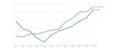
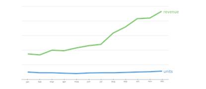
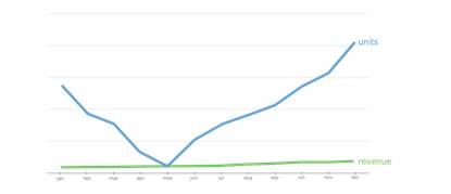
Figure 3 by applying two (independent) y-axis the message is determined by the different scaling. All three examples here are exactly the same data.
Tip 5. Show your true colors
Color plays an important role in our visual perception and attention, so apply it with care. A number of ground rules concerning color usage are:
- Use a neutral color as your base color (like white);
- Make sure objects with the same color are related or mean the same;
- Only use limited strong colors (like saturated red) for emphasizing important data;
- Use a neutral color (like light gray) for all contextual/context elements (scales, tick marks, reference lines, etc.)
Probably the most popular color scheme is Red, Amber & Green (RAG). This color scheme is also responsible for a lot of clutter and distraction on visualizations. Please bear in mind that some people can’t distinguish red from green (color blindness), so maybe it is better to use an other color for green (like blue). Also ask yourself the question: do we really need to show the green color? Limit yourself to coloring exceptions only.
Tip 6. Less is more
Sometimes I get the impression that visualization designers experience white space as their enemy. As long as they have space left they keep adding stuff. But if you have answered your WHY question, there is no reason to add more. It is even the other way around: the visualization is done when you are done with removing components.
Tip 7. Trending topic
It is very common (unfortunately) to simplify trends over time into one single indicator/arrow: we have gone up or down compared to the result in the previous period. These point-to-point comparisons are terrible, as Stacey explains in her workshops and book. A popular alternative to this single indicator is displaying all historic context, cluttering the visualization. A good alternative is to make use of Tufte’s sparklines: they give enough historic context without cluttering your visualization.
Tip 8. Avoid chart junk
In your data visualization it should be DATA FIRST: let the data tell its story. Everything else is considered chart junk (as introduced by Edward Tufte), and should be minimized. Making the visualization look “nice” is mostly adding more junk and compromising your goal: to inform.
Tip 9. Save the pies for dessert
In most cases when someone uses a pie chart there are (far) better alternatives at hand. This is why Stephen Few saves all pies for dessert. We have had no need for them either, but should you insist on using one, apply the rules from Donna Wong:
- Never more than 4 slices;
- Use one single color (hue);
- Start at 12 o’clock and order the slices descending.
Tip 9.5 Sketch & experiment
This last tip is not concerning the visualization itself, but more on your design approach. This is why we have valued it with half a tip.
There are two important enemies to effective data visualization: software tools & actual data. When you start with software you run the risk to get distracted by the functions and features of the software. Actual data demands a lot of attention because of unclear definitions or questionable quality. Both make you loose the focus on the WHY and your visualization. This is why we use pencil and paper to start sketching the visualization. Make use of the “Five Design Sheet” methodology5 to design your visualizations.
TAKE ACTION:
Which of Michel’s 9.5 tips do you practice routinely? Which do you want to start practicing more?
1 //fellinlovewithdata.com/guides/how-to-become-a-data-visualization-expert-a-recipe
2
3 Readings in Information Visualization: Using Vision to Think – Card, Mackinlay & Shneiderman
4 Donna Wong
5 //fds.design
Join Measure Up
Sign up for the Measure Up newsletter and get free access to the "10 Secrets to KPI Success" online course and e-book.

Upcoming KPI Training
>> North America, Online Interactive, 15-19 April 2024
>> Australia/NZ/Asia Pacific, Wellington NZ, 7-9 May 2024
>> Africa, Cape Town SA, 8-10 May 2024
>> UK & Europe, Online Interactive, 10-14 June 2024
>> North America, Online Interactive, 3-7 June 2024


Connect with Stacey
Haven’t found what you’re looking for? Want more information? Fill out the form below and I’ll get in touch with you as soon as possible.
167 Eagle Street,
Brisbane Qld 4000,
Australia
ACN: 129953635
Director: Stacey Barr